Kerry Holeman
|
SaaS Navigation Changes A pharmaceutical research platform provider wants to ensure that the platform keeps ease-of-use for all roles at the center of its tightly scheduled major update release. The planned release included new navigation and permissions models that had not been researched or tested. |
|
read more
The Company Needed
• validation of the new navigation layers, labels and layouts
• to ensure users would know where they are as they navigate in the new poly-hierarchical model
• verify users can find and focus on the data they are seeking
• validation of the new navigation layers, labels and layouts
• to ensure users would know where they are as they navigate in the new poly-hierarchical model
• verify users can find and focus on the data they are seeking
|
My Role
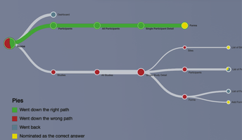
As the project lead I planned and executed research, recruited the users, created the use cases, wrote the test scripts, conducted the qualitative interviews and created the final report for the business which included several next-step recommendations. In order to write valid use cases for the test scripts, I leveraged previous role-based interviews, user personas, and workflows through the lens of the newly proposed navigation hierarchy. The navigation layout and content labels were tested with with a tree test. I wrote the test script and set up test using Treejack software. It was designed to cover questions about where new items should be placed, the labels of the items, if there were friction points based on time-on-task and where existing items could be moved to improve workflow. |
|
|
I wrote the qualitative interviews script to gain insight into the interaction design, wayfinding and data display changes. The interviews were conducted via zoom with shared video screens and interviewee-driven wireframe interactions through Figma wireframes. Three wireframe variations were used and they were presented in differing order to reduce first impression bias. |
|
After creating role-based use cases and scripts, I recruited 19 internal users performing three main roles to complete the tree test and qualitative interview with interactive wireframe options to understand how daily platform users in different roles navigate, orient themselves confidently, and complete a variety of tasks. |
|
The Challenges
• Newly hired VP was still learning the company and it's processes, lacked some leverage with other stakeholders
• Very tight timeline, not enough time for full IA review
• Legal team would not allow interviews or testing with anyone outside the company without an extensive NDA. Timeline did not allow for that level of recruiting effort.
• No budget to compensate testers
• Development team was making unapproved changes as they worked
Key Research Insights
• Majority of users felt confident in their understanding of where they were located in the Study hierarchy
• More than 50% of the testers across all roles preferred version A of the wireframes they walked through (wireframe display order was varied to address potential first view bias)
• The tree test indicated a need for deeper investigation around two modifier labels for Forms and Reports
• 33% of the testers thought version C of the designs could be a great improvement specifically for the small set of admin users who set up new studies and switch frequently between studies
The Result
I was able to:
•Validate high confidence in ease-of-use for 1 of the 3 wireframed navigation layouts
•Recommend 2 navigation item label modifications
•Ensure that users knew where they were while navigating in the new poly-hierarchical model
•Verify users can find and focus on the data they are seeking
•Identify opportunities for future enhancements
read less
|
Research Decisions re: Adopting a New Platform A company offering a Stage 3 clinical trials platform for pharmaceutical research wanted to understand why the platform had low adoption rates by the researchers who were offered free access to it and how that adoption rate can be improved. |
read more
|
The Company Needed to Understand
•Why do some Clinical Trial Sponsors mandate Platform usage? •Why do some Clinical Trial Sponsors not mandate platform usage? •When usage is not mandated, what persuades clinical researchers to use the platform? |
|
My Role
As the project lead, my strategy was to use a combination of qualitative research interviews combined with existing research on the psychology of change to understand users' attitudes toward the platform and create strategies to address any negative issues and build trust in the platform. |
|
|
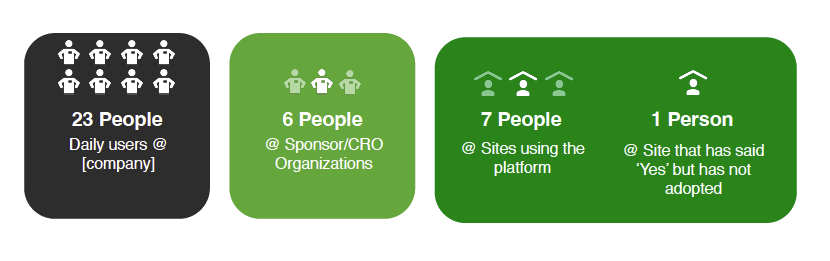
Knowing that recruiting was going to be the most difficult part of the project, I created an email introduction template and a tracking spreadsheet of users (sorted by role) to whom I sent a 'warm call' email asking for interview time. Over 130 emails resulted in 40 people who agreed to be interviewed and recorded with a signed NDA. I was able to actually schedule and conduct qualitative interviews via Zoom with 37 people to understand their perspective and needs. |
The Challenges
•Short time frame
•Extraordinary difficulty navigating internal company silos of information
•Legal team required exhaustive NDAs from everyone external to the company despite already being platform users
•Difficulty identifying and recruiting from all types of users (especially independent Site research leads)
•No budget for interview time remuneration
The Process
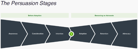
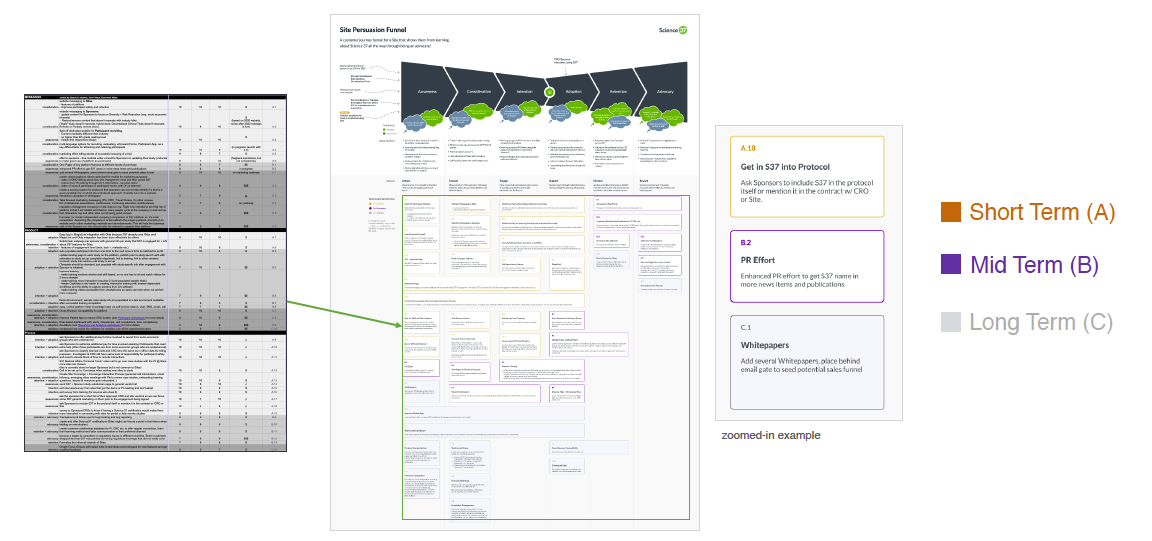
Working with a dedicated visual designer we created a custom persuasion funnel addressing the issue we uncovered.
After doing a theme deep dive, we were able to map our interview themes and pain points to stages in a persuasion funnel.
Working with a dedicated visual designer we created a custom persuasion funnel addressing the issue we uncovered.
After doing a theme deep dive, we were able to map our interview themes and pain points to stages in a persuasion funnel.
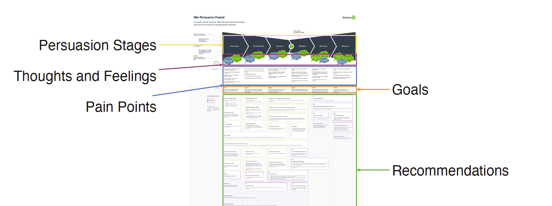
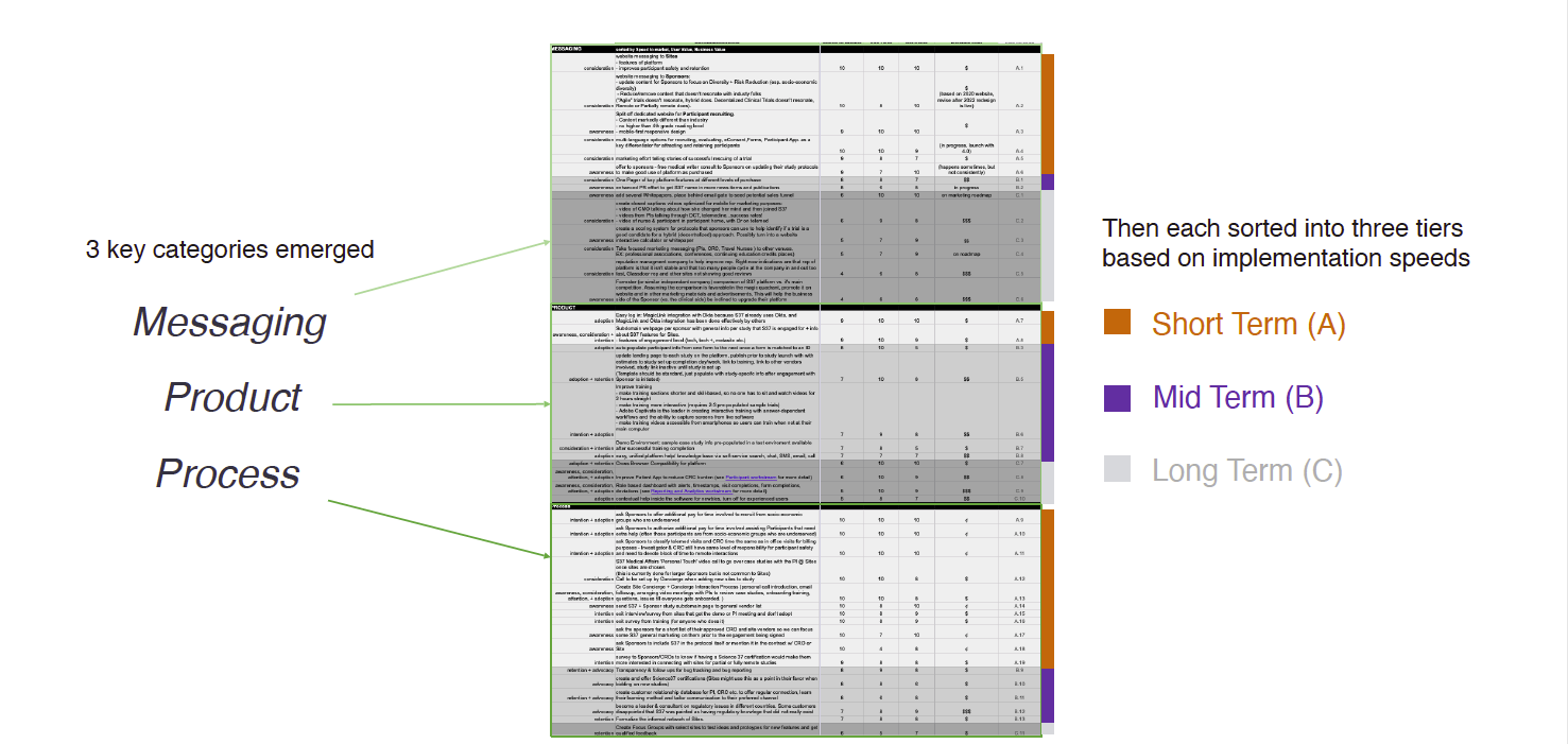
I then created a spreadsheet to detail 43 recommendations to reduce/remove identified pain points based on our interviews + existing writings on the psychology of change.
The recommendations were sorted and coded by
•3 Key Categories : Messaging changes, Product changes, and Process changes
•Ease/speed of implementation for each recommendation
•Relative cost of implementation
•Size of impact
The recommendations were sorted and coded by
•3 Key Categories : Messaging changes, Product changes, and Process changes
•Ease/speed of implementation for each recommendation
•Relative cost of implementation
•Size of impact
Key Research Insights
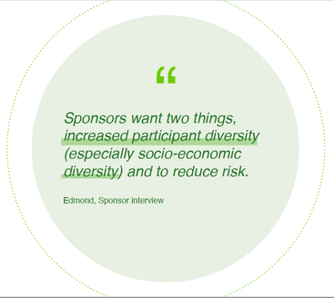
•Sponsors want two things, increased participant diversity (especially socio-economic diversity) and to reduce risk.
•Revenue models were a key factor. Site owners had very low trust in the system to receive, store and transmit data. Since gathering and reporting data has a significant impact on their revenue, they were not willing to make that level of investment without a mandate from the Sponsor. Sponsors with low trial participation were not willing to mandate useage that might cause Sites to drop out of the trial and potentially kill the overall trial.
|
•The reason for change needs to be compelling when people are already very busy. Clinical Trials are frequently an additional income source after most users main day job. Some sites (especially in academics) may end up running 10 studies at a time, and they’re already using a number of different kinds of software based on various trial requirements.
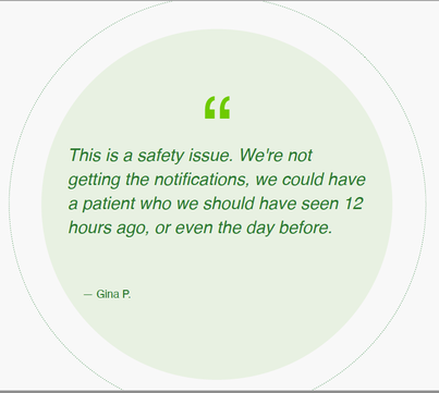
•There were user reported bugs that were safety issues with the potential to kill a study and they were not addressed in a timely manner. That slow response cost the company a lot of trust and negative talk between Sponsors and Site Owners about using the platform. |
The Result
I gave the company 43 recommendations that were explicitly linked to various stages in the persuasion funnel. Broken down by time, cost, and area of opportunity. It was a lot for the leadership team to take in.
The key finding was that the company had very little trust in the marketplace due to slow bug fixes and software updates combined with very high employee turnover leading to very erratic relationship engagement with users. (We looked at Glass door ratings as well once we learned this and it was supported by a number of unhappy former employees).
Although the most costly recommendations were to change internal processes and hire a reputation management firm (not a welcome recommendation to the leadership team), the single most important thing I emphasized as the immediate starting point was:
|
Implement continuous analytics collection and evaluation in relation to platform useage and support issues.
It doesn't matter if it's a valid bug or lack of user knowledge. You need to see what people do when logged in and where they encounter friction. The lack of ability to identify and triage these types of issues kept the company from benchmarking and using data to show customers and users improvments to their platform. |
read less
|
Save millions with good content A financial services company saw data showing a surge in people calling and going online to take money out of their retirement funds. Would a page redesign help quell that? |
|
read more
The Company Needed
•To understand the driving issues behind the recent significant increase in customers seeking withdrawals from their retirement accounts
•Find a way to significantly reduce the number of calls related to withdrawals as well as the length of time for each call
•Personalize information on the website so that customers can self-serve to get relevant information to support their decision making efforts
|
My Role
Us the UX lead, I spent a lot of time with the business team, researchers and subject matter experts to understand the customer needs and prioritize them for the team. I worked closely with our research advisor to plan the usability testing and build wireframes for interactive testing. I took turns with the research lead to run usability and accessibility testing sessions, and collaborated closely with our content and visual design specialists and the development team. I also planned our releases in step with other teams to keep aligned with their work when it makes sense. 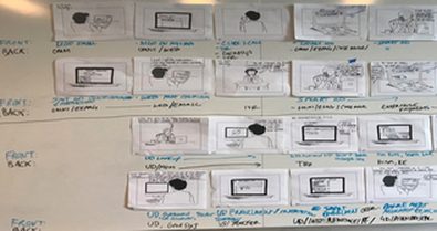
|
The Challenges
•This was anticipated to be a 12 month project to research, design, test, develop and launch a major update to the withdrawal center. •Receiving and evaluating call center data and matching it with related web data was very tricky and highly manual. •The project design mandate required mobile first design for pages with a great deal of content. |
|
Key Research Insights
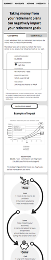
There is a lot of fear and embarrassment from customers needing to take money out from a retirement account, and they feel more private and less judged if they can self-serve online. Our design hypothesis was wrong. No one needed or cared about an interactive, personalized sliding graph to estimate the growth of their funds over time. The uptick in people needing money had to do with their fear about bankruptcy due to the economic conditions. Identifying this unexpected fear behavior in research sessions led to a complete revisit of the page content first, with a key section at the top highlighting how most retirement funds are protected in bankruptcy. The Result Launching our MVP with only a content update made a much larger impact in reducing withdrawals and calls than any of the subsequent design change work. Overall, the changes in the first year saved the call center almost $2.4 million in call numbers + length and reduced the number of people taking money out of their accounts by 28%. |
|
read less